


Since 2009, this has been my blog that is irregularly updated with short items about my activities as a type designer, teacher, information designer, and writer. It’s a single long scroll in reverse chronological order.
posted April 2025
Comma
Sans released

Comma SANS was released in April 2025. It is a low-contrast sans-serif typeface that takes its roots from Comma BASE, a high-contrast sans-serif that was released in 2021. Together, they form a versatile superfamily of fully interchangeable sans-serif typefaces.

Comma Sans, with its eight weights, is ideal for headlines, but its space-saving proportions, refined kerning, and well-balance d justification make it equally effective for body text – it is a true workhorse. Its expressive character, combined with its 90° geometric stroke endings, makes it highly suitable for everything from signage and user interfaces to editorial work and scientific publications.
Comma Sans is uniwidth, a powerfull feature, highly appreciated by designers: No matter what weight you choose, it will always take up the same space.
Comma Sans includes 16 styles, supports 37 languages, offers OpenType features for advanced typography, and includes small caps and ligatures.
posted April 2024
Type
design – a Never-ending Story

Parenthesis is a journal that broadly covers fine and private press printing, as well as bookbinding, typography, collecting, publishing, and related areas. It is published twice a year by the Fine Press Book Association (FPBA), alternating between North America and Europe.
I am very pleased that the spring issue of Parenthesis (2024, No. 46, edited and designed by David Jury) has been set in my Nexus typeface.
In addition, I wrote a four-page in-depth article about my experiences in type design: »Type design – a Never-ending Story«. For the occasion this article was not set in Nexus, but in Comma Base.
posted February 2024
Elsevier
Sans, custom typeface


In the last 10 years I have been working for Elsevier on a regular base, designing custom typefaces and several logo’s. For the main logo of Elsevier I designed the wordmark to replace Times New Roman. For Elsevier’s various websites, I designed a custom typeface called Elsevier Sans. It is a relatively open, widely spaced typeface, fully tailored to meet the needs of one of the largest publishers in the world.
posted January 2024
Scala
20 years in use at Metro Los Angeles

Since 2004, Scala Sans has been used by the Los Angeles Metro and remains a key part of the system. Its humanistic design perhaps offers a welcome counterbalance to the growing trend of ‘modernist’ sans-serifs. Scala continues to be just as popular after 20 years.
posted
February 2023
Catalogue
design for Lenneke van der Goot


For a long time, I focused on type design, but in 2023, artist Lenneke van der Goot invited me to design a catalogue of her recent lithographic work, for which she had won the Grafiekprijs Pim Olivier. We worked closely on the design, using Comma Base throughout the catalogue, and in the end, it felt good – after such a long time – to have designed something that was printed again.
posted October 2022
Footnotes
D features my article on Telefont

Footnotes, one of the best magazine on type design, is published by the Swiss-based typefoundry LaPolice. Their latest publication (Footnotes D, October 2022) features my article ‘Telefont and the last Dutch telephone book’, in which I write about the advantage of being type designer and book designer for the same project, in this case the Dutch telephone book. Excellent print quality and a real page of the 1994 Dutch telephone book is inserted.
posted July 2022
TypeParis:
lecture and typecrit

TypeParis 2022 was a great event. I did a typecrit with an international group of students, followed by a lecture on July 7 2022, in a fully packed lecture hall. Thanx to Jean François Porchez for inviting me.
posted June 2022
Gutenberg
Jahrbuch 2022


The Gutenberg Jahrbuch is a German publication that has been published annually since 1926 by the renowned International Gutenberg Society. In 2022, Ralf de Jong, professor at the Folkwang University of the Arts in Essen, was responsible for the book's typography. He used my Comma Base throughout the book, marking the first time the Gutenberg Jahrbuch was set in a sans serif typeface! De Jong also conducted an in-depth interview with me, in which I discuss the origins of Comma Base.
posted September 2021
National
Holocaust Names Memorial


More than 102.000 dutch victims, Jews, Roma and Sinti, are immortalized in bricks that make up the National Holocaust Names Memorial in Amsterdam. When it was unveiled in September 2021, just touching the bricks often evoked a strong emotional reaction, not only from family and survivors. Designed by architect Daniel Libeskind, I hope my Scala Sans typeface makes an equally timeless contribution to this powerful monument.
posted July 2021
Comma
Base city street signs

To promote Comma Base, I transformed well-known city street signs into versions using Comma Base. The examples featured Paris and Berlin at the top, with London and Amsterdam at the bottom. Some people even congratulated me, believing that these prominent cities actually used Comma Base for their street signs. This approach is a proven method for testing a typeface’s design in a context that’s familiar to everyone.
posted June 29, 2021
Comma
Base... a new typeface

Martin Majoor’s latest typeface Comma Base can be seen as a missing link between serif and sans. In fact it combines the best of both worlds!
Comma Base supports several OpenType features for advanced typographic control. It consists of 16 styles, 8 weights from Hairline to Ultra, in both roman and italic.
Comma Base is a uniwidth font. This means changing a text from normal to bold doesn’t affect the set width, a professional feature that is highly appreciated by graphic designers.
“Comma Base is a splendid humanist sans that brilliantly blurs the line between sans and serif. ” – John Boardley.
posted June 28, 2021
Martin
Majoor... a new type foundry

In 2021 Martin Majoor launched an independent type foundry under his own name. Majoor is known for his award-winning typefaces (Scala, Seria, Nexus) that were originally published by Fontshop. His Scala and Scala Sans are considered ‘classics’ and are among the first digital typefaces. In collaboration with Jos Buivenga he designed the large and successful Questa family.
In his latest typeface ‘Comma Base’, he explores the basic shapes of a typeface, with both typical sans features and at the same time serif elements. It can be seen as a typeface featuring the best of both worlds. Comma Base is the first typeface to be released by his own foundry.
posted October 2020
Double
interview for Fontstand

“A Dialogue Between Two Distinct Creative Minds” is a double interview with Jos Buivenga (exljbris) and Martin Majoor by Huda Smitshuijzen AbiFarès about The Questa Project. Questa is available to rent on Fontstand. https://fontstand.com/articles/questa
posted June 2020
Q&A in Romanian magazine FOI 2

The Romanian graphic design magazine FOI 2 published a Q&A with Dinu Dumbrăvician (National University of Arts in Bucharest, Department of Design) & Martin Majoor. Read one of the q&a below:
D: Is typography a caprice, a whim, or is it important? Why? For whom?
M: In our society we are surrounded by type. It already starts during our childhood when we learn how to read. From that moment on we are able to read texts, in books, on television, in the apps we are using, in games, in forms that we have to fill out, in shops and in the streets. The way in which the text information is presented we call ‘typography’. We are mostly able to read the information, even it is ugly or badly spaced or almost unreadable. If you want it and if you make an effort you can read anything. In that sense typography is not important.
M: But if we are going to consider aesthetics, good legibility and efficiency, good typography is important for the users. Although aesthetics is quite a personal and constantly changing matter we have a fairly common idea of what is beautiful and what is not. When it comes to legibility there is a broad consensus of what is good quality typography. There is such an incredible amount of typography around us that it is impossible to make everything good. But good typography surely contributes to a better understanding, to more efficiency and in general to a better society.
posted November 2019
Lecture
& workshop at BTK, Berlin


On 13 November 2019 I gave a lecture »Type in Time« at the Auditorium of the University of Art & Design BTK in Berlin. It was part of a week of teaching the students of BTK on how to »Design a Sans in 5 Days«.
posted October 2019
Teaching
at Plantin Institute of Typography

In October 2019 I started teaching ‘Microtypography’ at the Plantin Institute of Typography in Antwerp. As a base for my lessons I am using a text I already wrote in 2001 about microtypography: Did the French King Wear Size 49 Shoes? Some Trivia and Microtypographic Rules for Setting Text.
Microtypography is the foundation of well-crafted graphic design. The course, covers the editorial and typographic basics that every designer, editor, or publisher should know.
The Plantin Institute of Typography has its auditorium and office in the Plantin-Moretus Museum, a UNESCO World Heritage site in the heart of Antwerp. This complex is the only surviving printing-publishing house from the 16th and 17th centuries, complete with its original equipment and residence. It’s an understatement to say that the museum provides an inspiring setting for teaching typography.
posted October 2019
Madrid
Gráfica – Sustainable Cities

The third edition of Madrid Gráfica, themed ‘Sustainable Cities’, took place in Madrid in 2019. It featured a selection committee including Fernando Gutiérrez (Studio Fernando Gutierrez), Lizá Defossez (R2 Design), Félix Beltrán, Martin Majoor, and El Fantasma de Heredia (Anabella Salem and Gabriel Mateu). The opening took place on October 17, 2019 at La Central de Diseño, Paseo de la Chopera, 14.
posted October 2019
Five Types – solo exhibition in
Madrid


My solo exhibition ‘Five Types’ took place from October 17 to November 14, 2019 at the Palacio del conde de Altamira in Madrid. It was a crowded week for me: I was invited by Madrid Gráfica 19 for a series of (typo)graphic activities: the opening of the poster competition ‘Sustainable Cities’, a masterclass for the students of IED (Istituto Europeo di Design), a three day workshop for the students of ESD (Escuela Superior de Diseño de Madrid) and then of course the opening of my exhibition ‘Five Types’.
Thanks to all people involved and especially to Natalia Giménez, Manuel Estrada, Estefanía Moreno, Belén González Riaza, Floriana Petrosino and last but not least Susanne Zippel for organizing, supporting and helping me to make this week to a success.
posted September 2019
»Kroje«
conference, Warsaw

On 28 September 2019 I was invited to give a lecture during the typography conference »Kroje«, which took place in Warsaw. The title of my lecture was ‘On designing numbers’, a subject that has fascinated me for a long time.
posted September 2019
Double
Pencil Method

For the workshops I conduct, I use the Double Pencil Method. This technique was likely pioneered by Edward Johnston in the 1920s, using two pieces of chalk on a blackboard. In the photo above, I constructed a double pencil for demonstration purposes. The students use three regular pencils to build this remarkable tool.
posted September 2019
Questa
Grande as wood type

On 20 September 2019 I gave a talk at Modul Cărturești in Bucharest for a very interested crowd of Romanian designers and book lovers. One of the things I showed was the wood type version of Questa Grande, commissioned by Letterpress Amsterdam and manufactured in Romania by the great Petrescu Press. Tudor and Delia Petrescu drove three hours just to see my lecture, they brought me a box full of wooden Q’s which I later handed out to the audience. Read their blog on how they produced Questa Grande wood type, using state of the art cad/cam methods combined with good old woodworking, a great story: The story about Questa Grande as wood type
posted October 2018
TypeAmsterdam
2028

On 18 October 2018 I gave a talk during the TypeAmsterdam conference, at the Special Collections of the University of Amsterdam in collaboration with the Master’s program Type and Media of the Royal Academy of Art in The Hague.
My talk was titled ‘On Designing Numbers.’ Numbers are among the most universal forms of communication, yet in 99% of typefaces, certain figures display inconsistencies in the contrast – particularly noticeable when comparing regular and italic styles. Explaining this in detail would take too long here, but from now on, I will design typefaces with numbers that, in my view, have a logical contrast flow.
On the photo: Amsterdam House Numbers 1561–1769.
posted September 2018
Lecture
at ATypI
Antwerp 2018


The 1994 design of the Dutch telephone book can partly be seen as a reaction to the 1977 all-lowercase phonebook designed by the modernist Wim Crouwel with Jolijn van der Wouw. Collaborating with Jan Kees Schelvis, I was responsible for both the new typeface (later named Telefont) as well as the book’s microtypography – an ideal situation for a typographer. In 2018, it was announced that the last telephone book had been printed, it had literally become history! My lecture »Telefont: the Rise and Fall of a Typeface« is an in-depth analysis of the design of the Telefont family and the typography of the book. See the lecture here.
I also conducted a one-day workshop, Designing a Sans in One Day. Much to my surprise there was one special ‘student’. It was Niko Spelbrink (1940), my own teacher in 1983 and the person who made it possible for me to join URW in Hamburg in 1984, where I digitized my very first typeface. I owe him a great debt of gratitude.
posted August 2018
Akurucon
– Type conference in Sri Lanka


In the last week of August 2018 I was in Sri Lanka for a week full of research, workshops and lectures during AkuruCON, the first of its kind conference on typography in Sri Lanka. ‘Akuru’ means ‘letters’ and the Sinhalese and Tamil letters that were produced and used by the VOC Dutch Press in Ceylon (1736-1796) are the starting point for a research/revival project of which I was very proud to be part of! Thanks to Pathum Egodawatta and his awesome team of the Akuru Collective, and thanks to the Dutch Embassy in Sri Lanka for backing this project and inviting me to come to Colombo.
posted August 2018
Typofest
at Bozhentsi, Bulgaria


Typofest was a two week type design workshop in Bozhentsi (Bulgaria) from 13 to 24 August 2018. Participants from Bulgaria, Macedonia, Rumania and Turkey designed their own typeface, starting from scratch with a double pencil on an empty sheet of paper, and finishing it on their laptops as a digital font file.
I think I can count it amongst the best workshops I gave, not in the least because of the great collaboration with Sol Matas.
Thanks to Boril Karaivanov for a great organization, and thanks to the participants for their commitment and patience. Alexandru Nastase, Благојче Кузевски (Blagojche Kuzevski), Christopher Çolak, Iliana Popova, Ivelina Karpacheva, Krassen Krestev, Михаела Ангелова (Mihaela Angelova) and Захарина Петрова (Zaharina Petrova).
posted April 2018
‘Blank’ stamp for the Dutch postal service

In 2018 I designed a postage stamp for the Dutch postal service that was blank for the most part. The Dutch postal service offers the possibility to design ones own personalized stamps. To do this a picture has to be uploaded and a week later a bunch of stamps are being send to your home address.
The only part that cannot be designed is the border lettering for which I was responsible. I designed three versions: Nederland, Internationaal and December. Because of the small size of the lettering, I designed the characters without serifs but with very high contrast. I also chose to use lowercase lettering, in contrast to the usual practice of using all capitals for the word ‘Nederland’. The illustrations in the examples above are by Kaja Majoor.
Update Januari 2021: I liked the characters of the lettering so much that I decided to make a complete font out of it. This has become Comma Base.
posted April 2018
Lecture
during Fontstand 2018 in Zagreb

The very first Fontstand International Typography Conference took place on April 21, 2018, in the Croatian capital of Zagreb. I had the honour to open the conference with my lecture ‘Designing the Dutch telephone book’.
posted November 2017
Creative
Characters interview

For the MyFonts series Creative Characters – The Faces behind the Fonts I was interviewed in 2017 by Dan Reynolds.
»Modernism is a movement that started by radically rejecting traditional values. In the beginning, this made sense – in a way. But now, a hundred years later, it has become an extremely dogmatic movement. I try to preserve traditional values, and use them to develop a modern view on type design, without being dogmatic. It is like handing over your own mistakes to yourself, in order to improve the world of type. I will never say: Let’s keep it this way. I’d rather say: Let’s move on!«
posted June 2017
ISType, Istanbul 2017


ISType 2017 took place in the historic city of Istanbul. Many great speakers were present, but for me a one-day-workship was maybe more important than my lecture ‘Changes in Type Design’.
posted June 2017
Plug
& Play in Porto, Portugal

Plug&Play took place in Tiatro Rivoli in Porto, Portugal on 18 May 2017. I was invited to lecture about The Questa Project. Among the 10 international speakers from Germany, Spain, Italy, Portugal and the Netherlands, the Dutch delegation – with Max Kisman, Underware and myself – was fairly prominent.
posted April 2017
Kirjak 5, typography seminar in Tallin


In Estonian, »Kirjak« could mean ‘letter’ or ‘writing’. It is also the name of an interesting conference on typography, taking place in beautiful Tallinn, the capital city of Estonia, on April 7, 2017. Mart Anderson (left on the photo) is the charismatic organizer of the seminar, who asked me to not only give a lecture, but also conduct a one day workshop.
posted September 2016
One-day
workshop during ATypI Warsaw

Fully concentrated participants during my masterclass ‘Designing a sans in one day’ during ATypI 2016 in Warsaw. The goal was to show if it is possible to design a sans serif in 1 day, without a computer. The masterclass was limited to 20 participants and took take place on September 13th 2016 at the Polish-Japanese Academy of Information Technologies (PJAIT). Catherine Dixon, an accomplished designer herself, wrote: “Happiness is the opportunity to do a type drawing class with one of your design heroes : thank you, life + Martin Majoor + ATypI ❤”.
posted July 2016
Lecture
and printing at Schriftenfest Dresden


Der Verein für die Schwarze Kunst (Association of the Black Arts) organized ‘Schriftenfest Dresden 2016’ for which Eckehart SchumacherGebler asked me, among others, to give a lecture about my type design work, titled »Zeit und Abstand«. It took place on 18/19 June 2016 at the Offizin Haag-Drugulin in Dresden.
After the lectures we were given the opportunity to set and print our own business cards in metal type, for which I choose the rare Monotype Barbou. I used the italic for the name, but with regular small caps as starting capitals. As always it was a joy to work in the printing office.
posted June 2016
Printing
with Polymere plates


Printing with Thomas Gravemaker of LetterpressAmsterdam, using polymere plates to imitate letterpress with metal type. We printed a sort of type specimen of Scala, Seria, Nexus and Questa, on different sorts of paper. The resuling prints had a stunning tactile quality. Letter press is alive!
posted July 2016
Interview
in Novum

Since 1924 Novum – World of Graphic Design is one of the leading and most influential design magazines. For the July 2016 issue I was interviewed about the 25 years I have been designing type, from Scala to The Questa Project.
posted March 2016
Bielefeld
Bibel


On 16 March 2016 I gave a talk about about my typeface family Nexus, that was used for the typography of the Bielefeld Bibel. The complex design of this bible enables readers to experience the diversity of content and linguistic richness. This is not only achieved by its diverse typography (by 16 students of Fachhochschule Bielefeld), it also makes clever use of the four versions of my Nexus typeface: Nexus Serif, Nexus Sans, Nexus Mix and Nexus Typewriter
Design concept by Dirk Fütterer, typographic design by 16 students of Fachhochschule Bielefeld: Denise Albrecht, Clarissa Becker, Daniel Bergen, Mario Biehs, Marcel Hillebrand, Marc Jakubowski, Irma Knauer, Sonja Mense, Lena Öffler, Bastian Pätzold, Stephanie Schreiber, Niklas Tessmer, Mona Vogel, Arne Vogt, Fabian Wakenhut, Christine Wenning.
You can find a dedicated website here.
Watch this great stop-motion trailer here.
posted February 2016
Complex
typography for a controversial book

In 2016, Munich’s Institute for Contemporary History published a critical annotated edition of Mein Kampf. Rudolf Paulus Gorbach, the book’s designer, aimed for a clear visual structure free of clichés. He initially considered using his favorite typeface, Trump Mediaeval, but rejected it upon learning its creator, Georg Trump, had served in Hitler’s army. Gorbach insisted that the book’s elements, such as paper and typeface, must avoid any ties to individuals associated with the Nazi era.
Instead Gorbach choose Scala throughout the two-volume edition, not only because it has a serif and a sans version, but also because it was designed in 1989 by an independent type designer born in 1960 in the Netherlands – in other words, in no way connected to the Nazi era. In Hitler’s Annotated Struggle Steven Heller writes about the complex typography of the book.
posted October 2015
Questa
among best typefaces of 2014
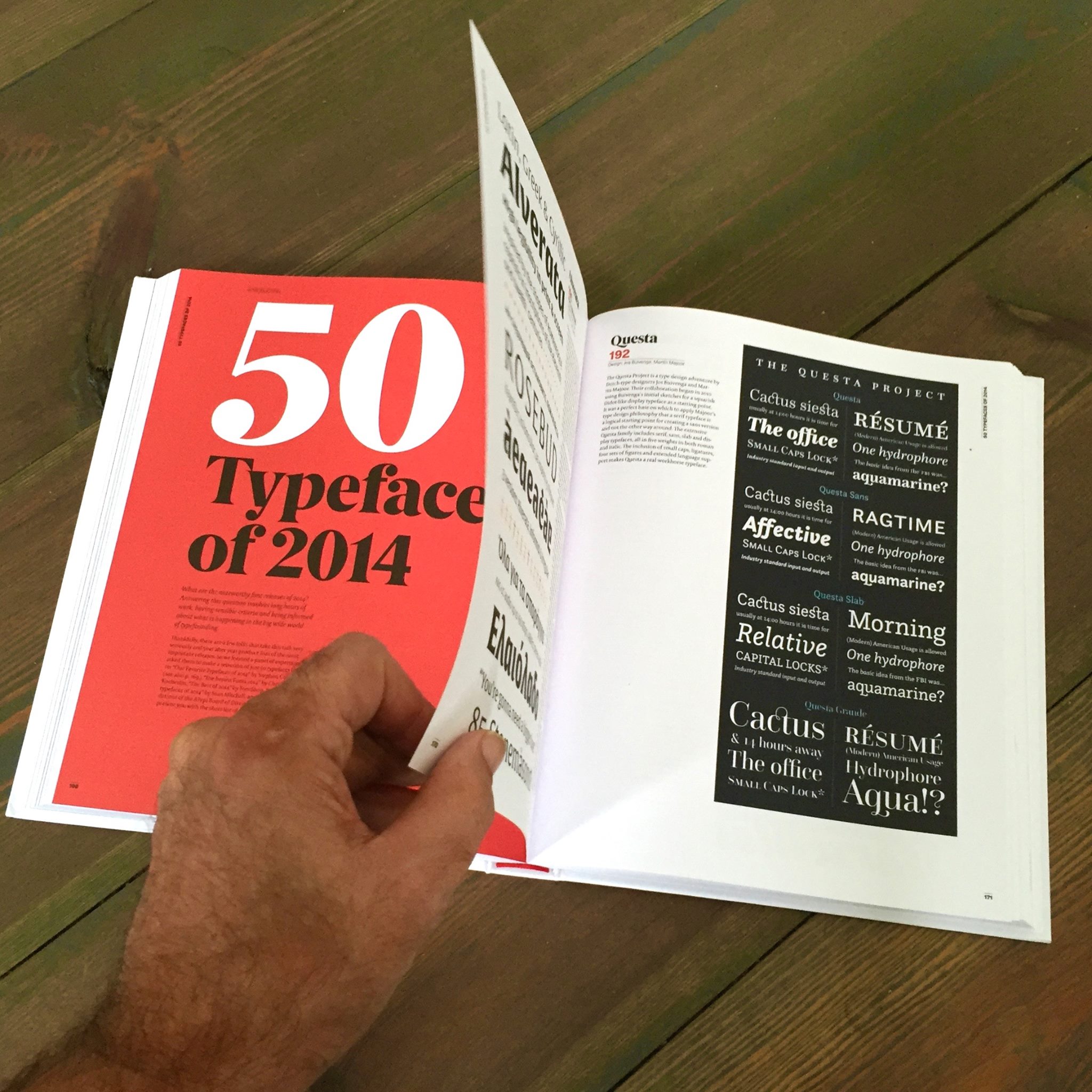
Questa ranked second in a list of the 50 most noteworthy font releases of 2014, Alvarata by Gerard Unger ranking first. It was chosen by a large panel of experts, consisting of John D. Berry, José Scaglione, Bruno Maag, Mark Barrat, Marina Chaccur, Jean-Baptiste Levée, Verena Gerlach, Dan Reynolds, Jacek Mrowczyk, Silvia Sfligiotti, and also from some lists like ‘Our Favorite Typefaces of 2014’ (Stephen Coles), ‘Die Besten Fonts 2014’ (Christoph Koeberlin), ‘The best of 2014’ (FontShop) and ‘The Best Typefaces of 2014’ (Sean Mitchell). The list was published in the 365Typo annual book, as well as in the Polish magazine 2+3D (‘50 Najlepszych krojów 2014 roku’). www.thequestaproject.com
posted September 2015
Warsaw
Autumn posters

Warszawska Jesień 1956-2015. P osters of the international contemporary music festival Warsaw Autumn. It was great to see all the 12 posters I designed for the Warsaw Autumn Festival (from 1999 to 2010) on display at ‘Kawiarnia Relaks’ in Warsaw, together with poster designers like Henryk Tomaszewski, Jan Lenica, Hubert Hilscher and many more.
posted September 2015
Lecturing
at Museum Plantin-Moretus in Antwerp

The Plantin Institute of Typography in Antwerp is accomodated in the historic building and museum of the printing workshop and home of the Plantin-Moretus family some 400 years ago. It is the world's only museum listed as a UNESCO World Heritage Site.
On 26 September 2015 I was invited to talk about The Questa Project during the academic session where the diplomas were awarded to the students from the programs/expert classes, including Typography & Design, Type Design, and Book Design.
“A master of type speaking in another master's house!” as Thomas Gravemaker would later observe.
posted October 2014
Exhibition
at Músaem Náisiúnta na Priontála (IE)

Types for the New Century is an exhibition of contemporary design and typography, held at the Músaem Náisiúnta na Priontála (National Print Museum) in Ireland.
Curated by Will Hill, Senior Lecturer in Graphic Design at Anglia Ruskin University in Cambridge, the exhibition features outstanding typeface designs from over 14 countries. The exhibition includes work from internationally established type designers, including Matthew Carter, Gerard Unger, Jonathan Barnbrook, Martin Majoor, as well as talented newcomers to the field.
posted September 2014
Questa
released!

On September 15th 2014 Questa was released, a type system with serif, sans and display versions, designed by Jos Buivenga and me. We can say that five years after we started making the first sketches, the result is very satisfying.
Questa has been released at Fontspring. The three regular weights of Questa, Questa Sans and Questa Grande are free. www.thequestaproject.com
posted August 2014
Symposion
»Qualität – Buchstäblich« in Raabs


On August 28th 2014 the Symposium »Qualität – Buchstäblich« in Raabs an der Thaya, was organized by Typografische Gesellschaft Austria (TGA). I talked about The Questa Project, just two weeks before it was going to be released.
The speakers list was impressive. In order of appearance: Jost Hochuli, Friedrich Forssman, Roland Stieger, Albert-Jan Pool, Margaret Calvert, Martina Flor, Luc(as) de Groot, Typejockeys, Filip Blažek, Martin Majoor, Petra Černe Oven, Veronika Burian, Matthew Carter and, last but not least, Piet Gerards.
posted March 2014
Workshop
at ESAD Amiens

Sébastien Morlighem invited me to conduct a for-day workshop at ESAD Amiens (France) from 18 to 21 March 2014. The ten eager post-diploma students produced some stunning types, it was a real pleasure to be their teacher.
I have known Sébastien since 2007, when he asked me to give a talk during an international conference about book design: About the book (Le Livre et ses Desseins), taking place at the beautiful Abbaye d’Ardenne, Caen. Later, in 2010, we cooperated on the book José Mendoza y Almeida – the »Godfather« of French Type Design.
posted May 2014
9/11
Memorial Museum uses Scala Sans

The 9/11 Memorial Museum in New York commemorates nearly 3,000 victims of the September 11, 2001 terrorist attacks. The Museum officially opened on May 15, 2014, following a dedication ceremony. The museum was designed by Davis Brody Bond, with the glass pavilion entrance designed by Snøhetta. The museum is part of the larger memorial site that includes the Reflecting Absence pools designed by Michael Arad in collaboration with Peter Walker. The museum uses Scala Sans in part of their signage.
posted November 2013
Fifty
typefaces that changed the world

Scala was chosen amongst the ‘Fifty typefaces that changed the world’. A book with this title was published in 2013 by the Design Museum in London. The digital revolution has made typesetters of us all as we define our identities through the typefaces we choose to communicate with the world. In this insightful book John L. Waters explores 50 of the most influential typefaces and shows them in use on posters, perfume packaging, buildings and more.
Waters: ‘Scala included small caps and non-lining figures as well as other typographical niceties not found among many of the new typefaces of that time’.
posted May 2013
In die Höhle des Löwen

It is no secret that I hate Helvetica, especially for the way it came into being (practically copying Akzidenz Grotesk). When André Baldinger invited me on May 18, 2013 to give a lecture at the Zurich University of the Arts (Zürcher Hochschule der Künste) I almost felt going into the the lion's den, or as the german’s say In die Höhle des Löwen.
Much to my surprise the swiss students who attended my lecture were absolutely not dogmatic. I had expected they were advocating Helvetica by fire and sword, but luckily my fear was not justified. I told the students that I am working with Jos Buivenga on Questa, a didot-like typeface that will also feature a sans serif version in the spirit of Akzidenz Grotesk. The above image tries to explain that we are not following the path of copying Akzidenz (like in Helvetica has been done), but rather create an original sans that is based on an original serif typeface. In the end I loved to lecture in Zurich, but I still hate Helvetica…
posted April 2013
My
first American solo show

A Taste of Type – The typographic world of Martin Majoor, my first solo show in the US (March 1 – April 20th 2013), was hosted by Brick City Gallery (part of Missouri State University) in Springfield. The show contained large size colour prints of sketches and type specimen of my typefaces Scala, Telefont, Seria and Nexus. Especially for this show I produced nine posters, combining wood type with different ‘hands’ from my Scala typeface.
Jacek Fraczak, a professor at the university’s Department of Art + Design and the driving force behind my ten-day stay, also invited me for lecturing and for a three-day workshop on type design.
During my stay I had the pleasure of meeting Douglas Wilson, the director of Linotype: The Film, a great documentary film about the Linotype type casting machine (that according to Thomas Edison was the ‘Eighth Wonder of the World’).
posted February 2013
Something
with Type
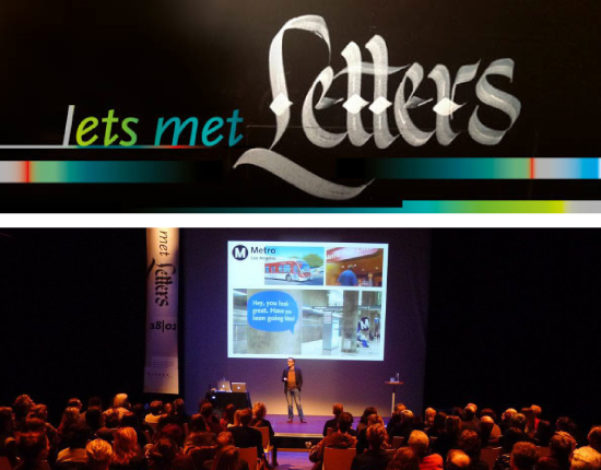
Nijmegen is the oldest city in The Netherlands, situated about 20 km from my hometown Arnhem. There has always been a certain rivalry between the two cities, not only between the local football clubs, but generally between the north (Arnhem) and south (Nijmegen). Despite this rivalry on 18 February 2013 I was kindly invited to give a talk about my type work. The lecture took place at LUX, a complex of cinema, theater and concert hall that was opened in the year 2000 by Catherina Deneuve. At the time it was Europe’s largest arthouse.
During the evening, that was called ‘Iets met Letters’ (‘Something with Type’), there were two other lectures: Job Wouters and Gijs Frieling talked and demonstrated their work for Belgian fashion designer Dries van Noten; in another lecture Bas Jacobs (from the ‘pan-European design collective’ Underware) lectured about their blackletter Fakir. The long evening was more than sold out, I really felt at home in Nijmegen and I almost missed the last train back to Arnhem.
posted December 2012
Workshop,
exhibition & book: ‘fajrant’
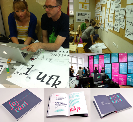
After the succesful type design workshop ‘Ala ma font(a)’ – Typefaces for kids! in 2011, the Academy of Fine Arts in Katowice organized a second workshop called ‘Ala has a pen – workshop type design based on calligraphy’. The workshop was spread over a period of 9 months with 6 sessions of 2 days each. Teachers were Filip Blažek, Verena Gerlach, Sarah Lazarevic, Marian Misiak and myself.
The students were introduced to the world of the broken script (‘Fraktur’ in German) using real steel pens and ink; the ‘double pencil method’ was used to show the basics of the humanistic italic; a totally different world of writing was explained, that of the Arabic script; the students were given insight in calligraphic swash skills. And all this was done without using digital media. Only at a later stage the resulting type designs were put into the computer.
On Friday 14th December 2012 the results of the workshop were exhibited in the main hall of the Academy. The accompanying book ‘fajrant’, designed by Zosia Oslislo, was presented during the opening of the exhibition. In the book 20 selected students were given four pages each to show their typeface, also all teachers had contributed texts on writing. The book was a tremendous achievement considering the little time and resources that were available. Especially for this book Berlin-based type designer Verena Gerlach designed a few characters of what she calls ‘Scala Fraktur’.
Update Januari 2013: For the book, designer Zosia Oslislo was awarded a Certificate of Typographic Excellence from Type Directors Club, New York.
Update May 2013: From April 8 untill May 5, 2013 the exhibition of ‘fajrant’ moved to Berlin, to the gallery of Mota Italic.
Update June 2013: In Poland the book was awarded Most Beautiful Book of the Year 2012 at the 53rd Competition of Polish Association of Book Publishers.
posted June 2012
My
website set in my own typefaces

Since May 2012 my website is set in my own typefaces (Nexus, Seria Italic, Scala Sans Condensed). All my typefaces are now available as Webfonts. Webfonts are compatible with Adobe Typekit, a service that has a partnership with FontShop. Essentially Typekit is an easy way to use high-quality Open Type fonts on the web.
Many thanks to FontShop’s Christoph Koeberlin who helped me implementing and testing the fonts on different platforms (Mac, Windows, Linux). I especially love to see it on my iPhone retina display.
posted February 2012
A week of typography in Madrid

In a cold week in February 2012 I was invited to Madrid for leading workshops and giving lectures at two different design schools.
The first workshop ‘Written Madrid’ was based on already existing letterwork by the students of Escuela de Arte 10 (Escuela Superior de Diseño de Madrid). The students had been taking pictures of street signs and lettering in order to make a font out of it. In Madrid there is a mixture of very old lettering and modernist lettering from the 1930’s (and unfortunatley Arial is taking over sometimes, a real nightmare).
The second event I took part was a seminar called ‘Semana del Diseño’ at Facultad de Bellas Artes in the Universidad Complutense. I contributed with a lecture, a panel discussion about typography and with a workshop that was called ‘Designing a sans serif in two days’.
After the seminar it was time to explore Madrid. Belén González Riaza, the organizer of the seminar, showed me the best places of the city. One of the highlights was my visit to the National Library of Spain, being shown around by José María Ribagorda, the author of the book ‘Imprenta Real – Fonts of Spanish Typography’ (awarded gold at the European Design Awards 2010). I had the great privilege to see some very old and rare treasures of Spanish printing.
In the end of my stay José Ramón Penela interviewed me for the Spanish website on typography ‘unostiposduros’.
posted January 2012
‘lapikon’:
Type design workshop and book

In 2011 the Academy of Fine Arts in Katowice organized a long typography workshop called ‘Ala ma font(a)’ – Typefaces for kids! Starting point was to design a typeface for children’s books. The workshop was spread over a period of 9 months with 6 sessions of 2 days.
One of the basic tools the students used in creating ones own typeface was a self-made broad-nibbed ‘pen’. This tool is a system of two pencils and an eraser, held together by two elastic bands. When writing characters with these two pencils, a sort of outline character appears, which is filled in with black, thus creating a beginning of a typeface design. It is also known as the ‘double pencil method’.
Although all 15 students in the end had designed a typeface, only a few of them had sticked to the children’s theme. The amazing results were published in the book lapikon (designed by Zosia Oslislo, see image above). All students wrote a short text about their type design and each font is presented in a two page type specimen. There were five teachers involved and they all wrote a text about their input into the workshop: ‘Research in typography (Anne Bessemans), ‘The basics of creating smart fonts’ (Filip Blažek), ‘How to start designing a typeface’ (Martin Majoor), ‘Why it is worth to be friends with the curves’ (Marian Misiak) and ‘Designing fonts for screens’ (Eben Sorkin).
At the moment a second workshop is taking place, called ‘Ala has a pen’. The stress is even more on writing and calligraphy. Teachers are Filip Blažek, Verena Gerlach, Sarah Lazarevic, Radana Lencova, Martin Majoor and Marian Misiak.
posted January 2012
Questa @ ‘Graphic Design: Now in Production’
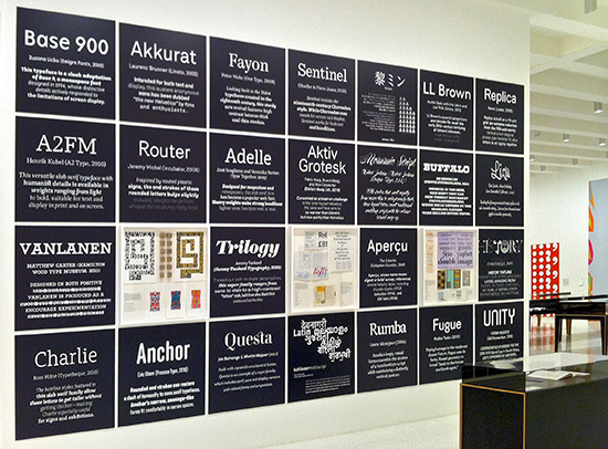
Jos Buivenga and I were very proud our Questa
typeface was choosen to take part in the major international
exhibition ‘Graphic Design: Now in Production’, the largest American
museum exhibition of its kind since 1996. Ellen Lupton, one of the
lead curators of the exhibition, invited us to show the Questa family,
a perfect subject since we are still working on it.
The exhibition and the catalogue explore “how graphic design has
broadened its reach dramatically over the past decade, expanding from
a specialized profession to a widely deployed tool. Featuring work
produced since 2000 in the most vital sectors of communication design,
‘Graphic Design: Now in Production’ showcases a series of developments
over the past decade, including the renaissance in digital typeface
design”.
Questa is shown on a wall installation (see the image above) featuring 25 typefaces from different designers, including Zuzana Licko, Matthew Carter, Hoefler & Frere-Jones, Laura Meseguer, Peter Bilak and Underware. The show travelled to: Minneapolis, New York, Los Angeles, Michigan, Houston, Winston-Salem and Providence.
posted January 2012
FF Nexus Web and revised Open Type Swashes
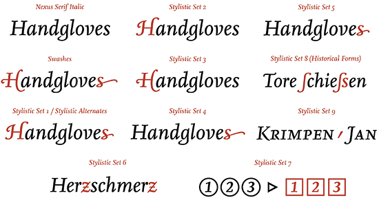
In October 2011 the Nexus family was made available as Webfont.
Webfonts are compatible with Adobe Typekit, a service that has a
partnership with FontShop. Essentially Typekit is an easy way to use
high-quality Open Type fonts (like the Nexus family) on the web.
For this occasion Nexus has been revised, mainly for the italic swashes in the Stylistic Sets. The overview above illustrates what the different Stylistic Sets will do (there are two different Swash capitals and there is a short and a long lowercase end character). FontFont technician Christoph Koeberlin made a instructive video of how to get access to the swashes. There is now also a special Stylistic Set for the Jan van Krimpen comma (SS09).
A nice example of Nexus Swashes can be found here: Das Magazin L ...Leben.Liebe.Laster ...
posted October 2011
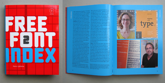
Design for Music
 Hans
Lijklema,
my dutch colleague and friend in Warsaw, has again compiled, written
and designed a great book on graphic design. This time it is the
second book in the series ‘Pictographic Index’ (published by The Pepin
Press in Amsterdam). He is also responsible for the highly successful
series ‘Free
Font Index’, of which the second volume was published in 2010.
Hans
Lijklema,
my dutch colleague and friend in Warsaw, has again compiled, written
and designed a great book on graphic design. This time it is the
second book in the series ‘Pictographic Index’ (published by The Pepin
Press in Amsterdam). He is also responsible for the highly successful
series ‘Free
Font Index’, of which the second volume was published in 2010.
Lijklema did not forget to include a few designs for classical music, one of them being my work for the Warsaw Autumn Festival, the oldest European contemporary classical music festival. I was the festival’s graphic designer for 11 years, up until 2010.
‘Pictographic Index 2: Design for Music’,
published in 2011, edited/designed by Hans Lijklema, written/compiled
by Karolina & Hans Lijklema.
posted June 2011
Lettermix / Which character do you see?
 From
25th untill 28th of May 2011 the Centre of Contemporary Art (CoCA) in
Toruń, Poland, for the second time organized PLASTER
– International Festival of Typography and Poster Design. It
was a four-day event with lectures, 3 workshops, and exhibitions of Ed
Fella, Władysław Pluta and myself.
From
25th untill 28th of May 2011 the Centre of Contemporary Art (CoCA) in
Toruń, Poland, for the second time organized PLASTER
– International Festival of Typography and Poster Design. It
was a four-day event with lectures, 3 workshops, and exhibitions of Ed
Fella, Władysław Pluta and myself. On top of the CoCA building my exhibition L E T T E R M I X was opened, a mix of old and new work covering a period of more than 20 years. The outdoor exhibition space is surrounded by 48 windows, each containing a frame of 70 x 100 cm. Another 35 frames are hanging on a square building in the middle of the terrace. I divided my exhibition into two parts: on the outside there is a chronological history of my type designs Scala, Telefont, Seria and Nexus. The inside building is filled with patterns, each consisting of one character taken from one of my typefaces. ‘Which character do you see?’ could be the subtitle of this especially designed part of the exhibition. The exhibition will be open untill July 24th 2011. Have a look at some pictures of the exhibition here.
posted January 2011
Scala acquired by MoA (Seoul)
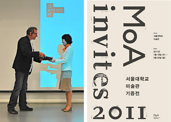
In October 2010 the MoA (Museum of Art Seoul National University) in
Korea acquired Scala for its permanent collection, the ‘Design and
Crafts’ collection. It was the first time the museum made an
aquisition of a typeface.
Shortly after my lecture in Seoul last
October (read
this post) I officially handed over Scala to Haeng-Ji Kim, the
curator of the museum (see left image). The exhibition ‘MoA Invites
2011’ (see the poster on the right) took place from 19 January 2011
untill 2 February 2011, showing all new aquisitions of last year,
including Scala. One of the nice things is that the museum actually
uses Scala in its printed matter: the english text in the catalogue is
set in it.
posted January 2011
My steel pen collection
 .
.
In 1980 Fred Smeijers and I started our studies Graphic Design at the at the School of Fine Arts in Arnhem. During the writing lessons we used broad nibbed pens, but our typography teacher – the late Alexander Verberne (1924-2009) – also showed us sharp pointed steel dip pens. Most of these pens had been manufactured since about 1800 in Birmingham (then the world centre for steel pens) by John Mitchell, A. Sommerville & Cº and Perry & Cº. In Germany manufacturers like Heintze & Blanckertz, F.Soennecken and Brause & Cº dominated the market of ‘Stahlfedern’. In Holland there was Gebr.Rikkers who had their pens manufactured in Birmingham (“where steel is king”).
Fred and I used the pointed pens for transitional lettering à la George Bickham (the universal penman), and especially Fred was quite skillful in this. But in the 1980s these pointed steel pens – or ‘Schelvispennen’ as we call them in Dutch – were hard to find because most of them were not manufactured anymore. We went to about every office supply shop we came across, also in London and in Berlin. It almost became an obsession but in the end we had collected hundreds of steel pens in all sorts of shapes and sizes.
Some pens can still be bought, but I thought it would be nice to share some pictures of the most interesting pens I have.
Have
a look at more pictures of pens and boxes here.
posted November 2010
Interview in ‘8 faces’ #2

Last week I received my copy of the second issue of 8 faces, the new succesful magazine of Elliot Jay Stocks. When he interviewed me for this issue one of the things I said was that “I am still always excited by books — real books, not iPads. The iPad is nice, but I like the three- dimensional thing that a book is. To me, a book is like a sculpture: you can hold in your hands.”
Exactely that is what 8 faces is: a real magazine, printed on heavy paper and smelling of intoxicating ink. You don't have to start it up, you just take it in your hands and immediately you can flip through the pages. No need to recharge it after reading the great content. Just put it aside, touch it once in a while, show it to other people or put it vertically on the bookshelf.
“If you could use just eight typefaces for the rest of your life, which would you choose?”. That‘s the core questions posed to eight leading designers from the fields of web design, print design, illustration, and of type design. From the eight typefaces I choose, six of them are hot metal typefaces, just because I think its quality is still superior to its digital counterparts. But I also just love the imprint of metal typefaces on paper, it ads yet another dimension to a book.
But even without using metal type, 8
faces (volume 1, number 2, published on November 2010) is a
lovely magazine. You will also find interviews with Ale Paul, Stephen
Coles, Tim Brown, Nick Sherman, Rich Rutter, Veronika Burian, and José
Scaglione.
posted October 2010
A week of type design in South Korea
 .
.
From 17 to 25 October 2010 I was invited to Seoul for a series of
workshops and lectures on typeface design. Highlight of the week was
the Type & Design Forum 2010
which took place at the Museum of Art (MoA) of the Seoul National
University. My work as type designer was the main focus of the event.
Many renowned graphic designers and typographers like Karel Martens, Neville Brody and Armand Mevis had been invited in previous years, but it was the first time a typeface designer was invited.
It was my first visit to Asia and it made a
big impression on me. continue
reading >>
posted October 2010
‘158 Answers’

In January 2010 I was asked by Tânia Raposo – then student at the Type
& Media postgraduate course of the Royal Academy of Arts in The
Hague (KABK) – to give an interview.
It was part of a larger project in which 11 students were asked by their teacher Peter Biľak to conduct an interview with a respected professional whose work was relevant for their personal work, but who is not a teacher at the KABK. The list of the interviewees is quite divers, and the students used all sorts of methods to conduct the interviews: face to face, voice over ip, online chat and email conversation.
Ken Barber by Fritz
Grögel, Peter Bruhn
by Nils Thomsen,
Christopher Burke by Brigitte
Schuster, John Downer
by Frank Grießhammer,
René Knip by Jon Glarbo,
Radana Lencová by Slávka
Pauliková, Martin Majoor
by Tânia Raposo,
Jan Middendorp by Yohanna
Mỹ Nguyễn,
Alejandro Paul by Martina
Flor, Huda Smitshuijzen
AbiFarès by Kristyan
Sarkis,
František Štorm by Irina
Smirnova.
All interviews were brought together in a small book of 112 pages.
And although ‘158 Answers’ was produced by the students themselves
(using a 1200 dpi laserprinter), in all its aspects it has become a
nice little book: the choice and diversity of the interviewees, the
size, the weight, the paper, the binding with an open spine. The text
was set in Brioni designed by Nikola Djurek, himself a postgraduate
student at Type & Media in 2005.
There is only one minor point of critic: there are only 50 copies...
A book like this deserves to be published in a limited edition, maybe
through Peter Biľak own small publishing house Typotheque.
posted September 2010
ATypI
Dublin: four personal highlights
ATypI 2010 – ‘The Word’ – took place from 9 to 12 September 2010 in
Dublin, at the historic venue of Dublin Castle. It was my first visit
to Ireland and the days I spent at the conference were both
interesting and fun. There are four personal highlights I would like
to share here.

1. Our lecture about ‘The Questa Project’

The main reason for going to the ATypI conference was to lecture
together with Jos Buivenga about our typeface in progress ‘Questa’. We
showed the way we work together, developing the serif text version
first and using that as a basis for the sans version. We are about to
start working on the display version, which will also be based on the
text version. This was our second mutual lecture about The
Questa Project (the first lecture was held in our home town
Arnhem), and we got some nice reactions:
“@martinmajoor has possibly the best theory on how to turn a serif face into a sans. And the end result looks fabulous.” (Yves Peters on Twitter)
Another event I was involved in was the panel discussion Managing
multiplicity - The Pitfalls and Pleasures of Collaborative Typeface
Design. The panel members were (from left to right) Hrant
Papazian (chair), André Baldinger, Erik Spiekermann, myself, David
Berlow and Nina Stössinger. For some type designers collaborating
means working together with technical people and clients, whereas I
think the real challenges of collaborating are on an artistic level.
Usually I don't collaborate in type design, but in the case of Questa
Jos and I found a true artistic collaboration.
3. Robert Bringhurst

During this ATypI conference I finally got to meet Robert Bringhurst
in person. His book ‘The Elements of Typographic Style’ is among my
favorite books on typography (and not only because Scala Sans is used
for the captions throughout the book). In another book ‘Carving the
elements: A Companion to the Fragments of Parmenides’ (pictured above)
Robert Bringhurst uses my Seria and Seria Sans in a way I had in mind
when I designed it back in 2000. Therefore I consider him not only a
great writer, but also a great typographer.
4. The ATypI program booklet

Last but not least: I was pleasantly
surprised by the fact that this years ATypI program booklet was
completely set in Scala. The design was done by Clare Bell and Brenda
Dermody, cleverly using fluoriscentic red for the captions. I haven’t
been to a lot of ATypI conferences, but I presume it is the first time
the ATypI program booklet is set in Scala. For me it is great to see
this, more than 20 years after Scala’s first appearance.
posted September 2010
Scala
family now available as webfonts
 .
.
Since the end of June 2010, Scala and Scala Sans are available as
Webfonts. Scala Webfonts are compatible with Typekit, a service that
has a partnership with FontShop. Essentially Typekit is an easy way to
use high-quality Open Type fonts (like the Scala family) on the web.
I am very proud that the website of
I Love Typography was one of
the first to use the Scala webfonts. In my view this site, hosted by
John Boardley, is todays best website on typography, and I think the
way Scala looks on the web is truly amazing (see image below, or
better visit the real site). The technical staff at FontShop sure did
a great job on hinting the Scala webfonts. I hope to change my own
website soon, and I am sure you can guess which fonts I am going to
use.

posted June 2010
Interview in ‘Free Font Index 2’
Hans Lijklema is a Dutchman living in Poland, just like me. We
regularly meet in the Warsaw coffee shops (not comparable with the
Dutch ones) to have a ‘lekker bakkie’ (Dutch for a good cup of
coffee).
Hans, who is the author of ‘Free Font Index 1’ and ‘Pictographic Index 1’ (both published by The Pepin Press in Amsterdam), has just compiled the second volume of ‘Free Font Index’ (2010). It is a type specimen that contains over 500 fonts by different type foundries.
A good part of ‘Free Font Index 2’ (about 50 pages) consists of texts, images and interviews about free fonts, thus making this book much more than a simple collection of free fonts. There are interviews with Donald Beekman (DBXL), Jakob Fisher, Ray Larabie and Svetoslav Simov. Jos Buivenga (exljbris) talks about ‘Serendipity in type design’ and Max Kisman wrote a tutorial on how to design and produce your own font.
Ellen Lupton is also present in the book. Hans Lijklema arranged an interview/discussion about free fonts between Ellen Lupton, Caroline Hadilaksono/Micah Rich (The League of Moveable Type) and myself (see the spread on the image above).
posted May 2010
PGR – Graphic Design in Poland

It is my conviction that you cannot be a good type designer if you are
not a book typographer.
Since 1999 I am the graphic designer for the Warsaw Autumn Festival in Poland, one of the oldest European music festival that is fully dedicated to contemporary classical music. I designed the inside typography of the programme books which was then a perfect opportunity to use and to test my newly designed Seria and Seria Sans.
I also designed colourfull covers for the books. The whole graphic design for the festival is purely typographic, maybe a reaction to the typical illustrative, handlettered Polish posters.
In 2010 Jacek Mrowczyk and Michał Warda
(from the Poznań Academy of Fine Arts) have published the book PGR.
Projektowanie graficzne w Polsce (PGR. Graphic Design in
Poland). They present the most interesting examples of Polish graphic
design of the last decade, and I am proud they also included the book
covers I designed for the Warsaw Autumn Festival. The book is in
Polish only.
posted May 2010
TypoBerlin 2010: Passion
![]()
On May 21, 2010, during TypoBerlin,
Sébastien Morlighem and I presented the book José
Mendoza y Almeida – the »Godfather« of French Type Design
(see the post below).
posted April 2010
José Mendoza y Almeida (the book)


José Mendoza y Almeida (1926-2018) designed typefaces like Pascal, Photina and ITC Mendoza. He is considered the “godfather” of french type design, creating type since he began working with Roger Excoffon at the Fonderie Olive in 1954.
The first ever dedicated book to
his work was published last March in Paris by french publisher
YpsilonÉditeur, as part of the Bibliothèque
typographique collection. It features several essays by
Sébastien Morlighem and Martin
Majoor, with an introduction by Jan Middendorp. Many
unpublished documents are reproduced in the book.
posted February 2010
Love for Type

Majoor and Buivenga met at a symposium in Dortmund, and over time, their connection deepened into an intensive collaboration. Working side by side at the screen or collaborating via Skype across the continent, they started designing a new typeface. The result of this serious project is Questa, an interpretation of historic Didot-like typefaces. Their collaboration was also a source of great design joy.
An important question was raised by Ingrid Kresse from OPA: how does type design relate to sustainability? She concluded it absolutely does. Majoor’s Scala for example celebrated its 20th anniversary in 2010!
The great poster (designed by Isabelle Vaverka & Jeremy Jansen) was created by combining two posters (one set in Majoor’s Scala Sans, the other one set in Buivenga’s Museo Sans) that were cut apart and reassembled into a kind of schizophrenic composition.
posted December 2009
Scala microsite

posted September 2009
Working on Questa

It all began in April 2009 after we had met at the 33pt.
Symposium in Dortmund, both giving a lecture. We knew each
other from the Academy of Fine Arts in Arnhem, but we had not seen
each other for about 25 years. We renewed our contact and after a few
meetings we decided that we wanted to do a type design project
together.
Questa in progress, a squarish Didot-like font that Jos originally had planned in one display style only, was a perfect basis to apply upon Martin’s typedesign philosophy about the form principle of serif and sans, as advanced in an article for Eye Magazine about the origin of the sans serif and Helvetica’s plagiarism.
More on the official site of The
Questa Project.
posted April 2009
33pt. Eskapade –
Beiträge zur typografie

With around 300 attendees, the 33pt.
Eskapade Symposium at Fachhochschule Dortmund (3 and 4 April
2009) was received positively by the visitors. Speakers were Autobahn,
Phil Baines, Jos Buivenga, David Crow, Siggi Eggertsson, Sven Ehmann,
Falk Haberkorn, Martin Majoor, R. Meek, F. Müller, Sven Voelker and
Von B&C.
Approximately 20 students, along with helpers from various disciplines within the Design Department, worked under the guidance of lecturers Stefan Claudius and Prof. Sabine an Huef to plan the two-day event. It was an exciting symposium, packed with interesting lectures, forum discussions and radio interviews by Typeradio (Liza Enebeis and Donald Beekman).

![]()